Let's Talk
MODO
Pay Your Way
Overview
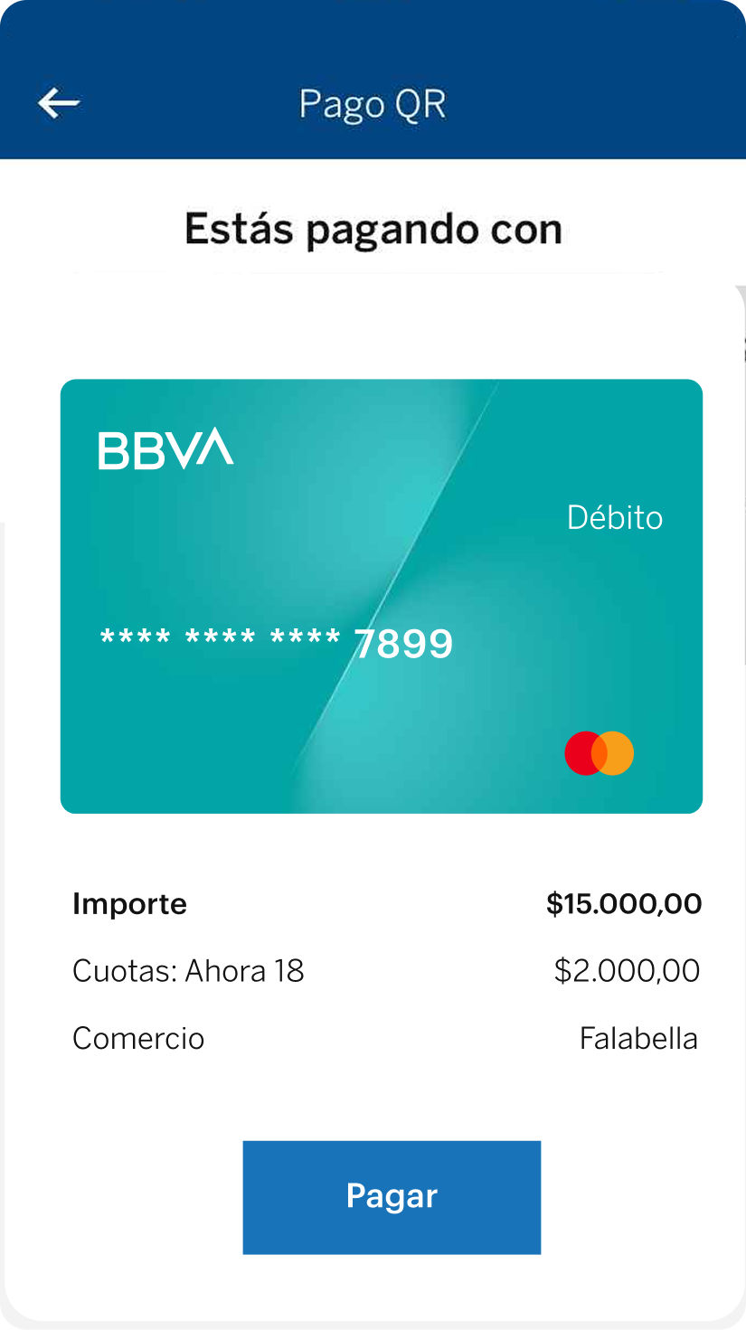
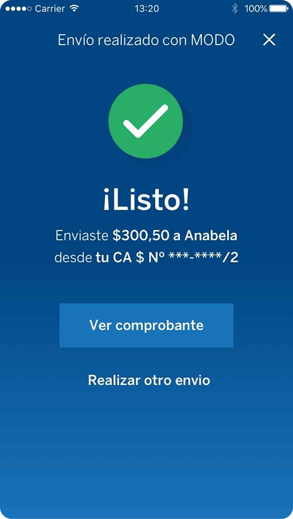
Created MODO's onboarding and money-transfer experience within BBVA's app — a completely new phone-number-based payment service users had never encountered before.
Business case
- ✦Users could technically complete the transfer flow but didn't understand what MODO was, why enrollment was required, or where their money was going — a trust gap that risked adoption despite the feature being functional.
Goals
- ✦Help users discover and understand a completely unfamiliar financial concept (phone-based transfers)
- ✦Build trust around enrollment and account linking
- ✦Validate that comprehension — not just task completion — was actually achieved
Challenges
- ✦Balancing innovation with trust: users defaulted to "if BBVA says it's safe, I'll do it," masking real usability issues in testing
- ✦Designing across a wide range of digital literacy, from tech-savvy to low-tech users
- ✦Diagnosing that the flow's problems were about understanding, not usability — task completion looked fine, but comprehension didn't
Results
- ✦SUS Score of 83.5, well above the industry benchmark of 68
- ✦100% of critical issues resolved (onboarding, enrollment, account linking)
- ✦Two rounds of moderated testing across tech-savvy and low-tech user profiles
- ✦Redesigned onboarding, enrollment flow, and microcopy based on direct research findings
Design Thinking
Context and Problems
Before designing the new MODO experience, we mapped the recurring friction users encountered with traditional transfers and the new phone-based flow.
Unfamiliar concept
Users had never used phone-number-based transfers.
Trust gap
Where does my money go after I tap send?
Enrollment friction
Why do I have to enroll in MODO first?
Account confusion
Which account sends and which receives?
Discoverability
Feature was hard to find inside the app.
Microcopy
Labels did not match user mental models.
Information Architecture
Mapping the MODO flow
MODO Flow
Entry
Onboarding
Account Enrollment
Returning User
Payment
Entry
Onboarding (First time)
Account Enrollment
Returning User
Payment
UX / UI
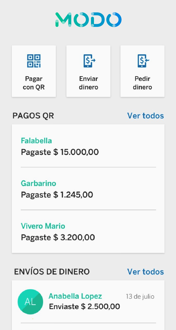
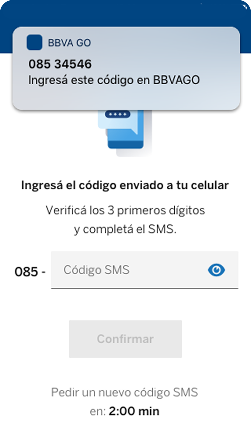
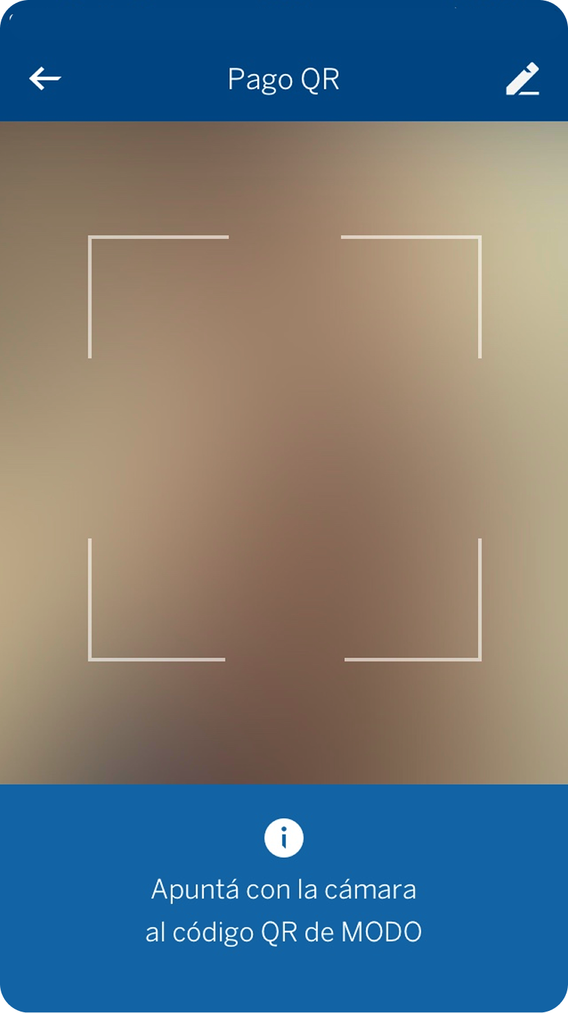
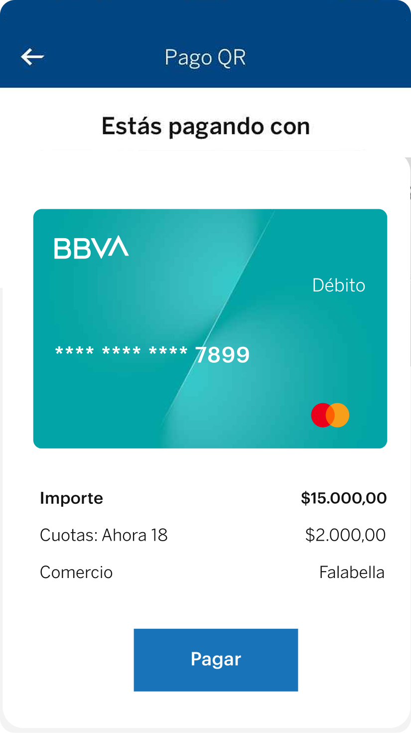
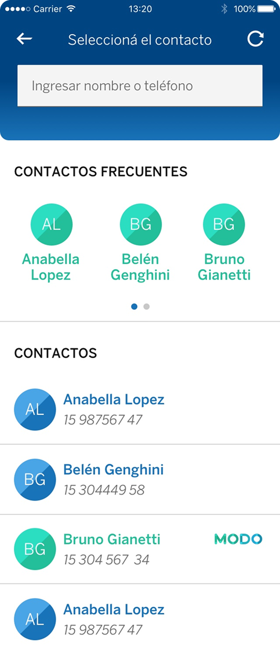
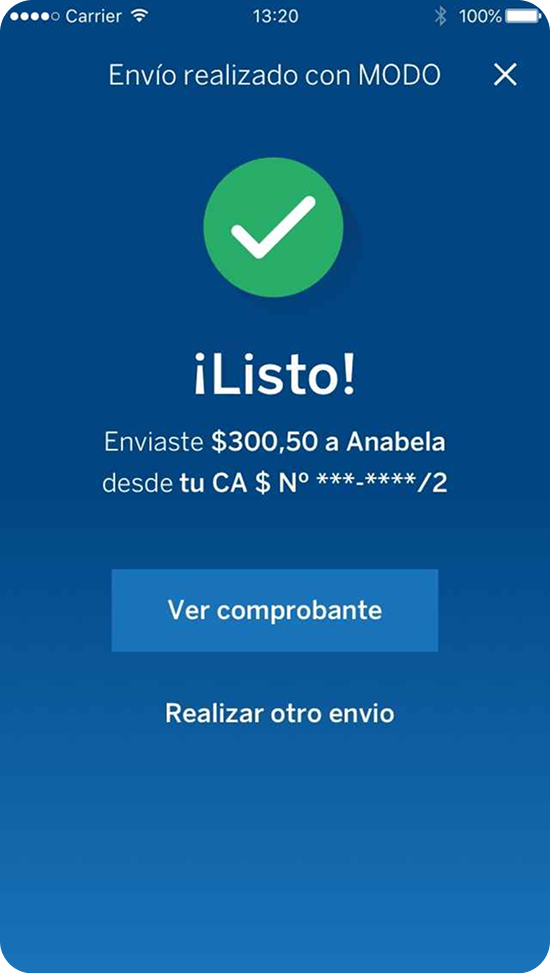
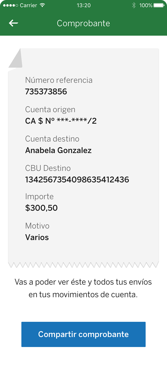
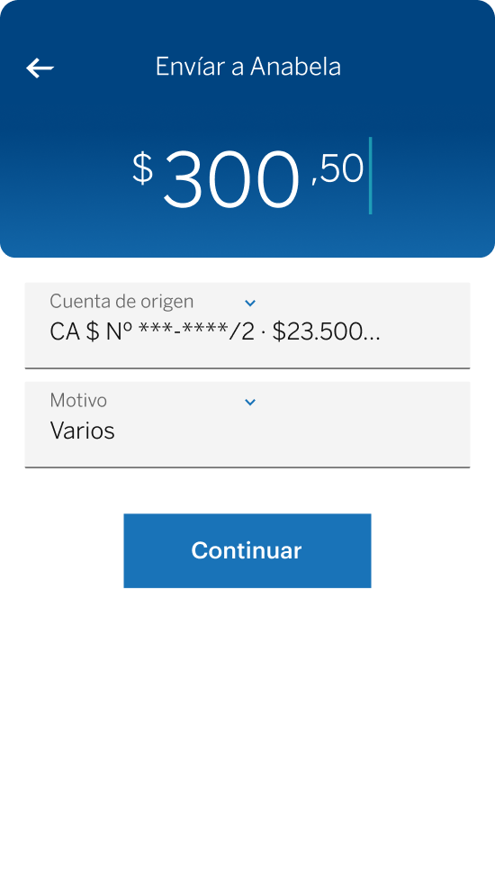
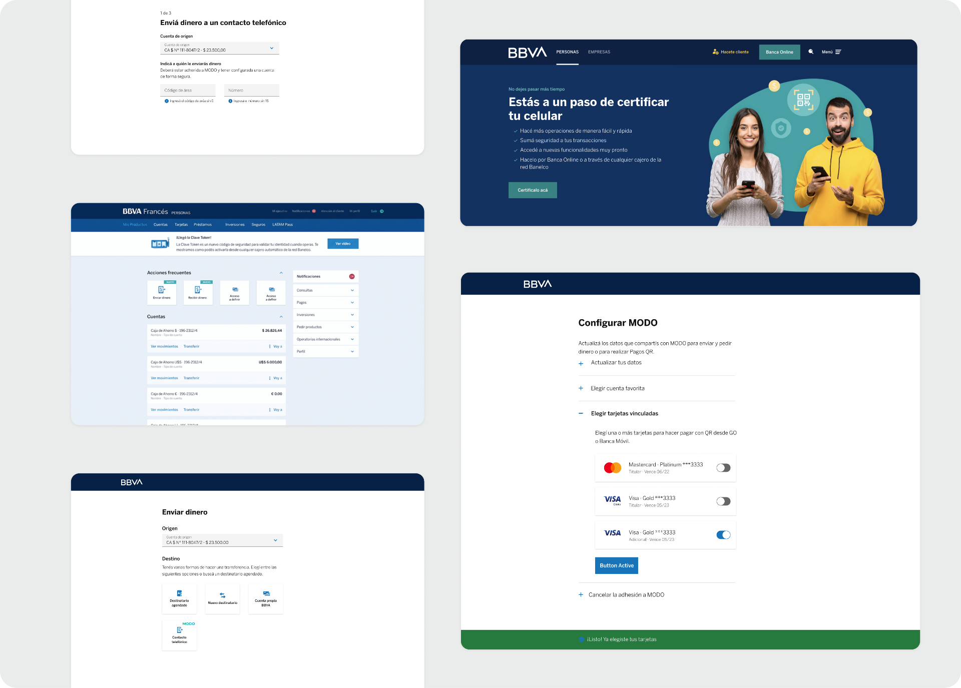
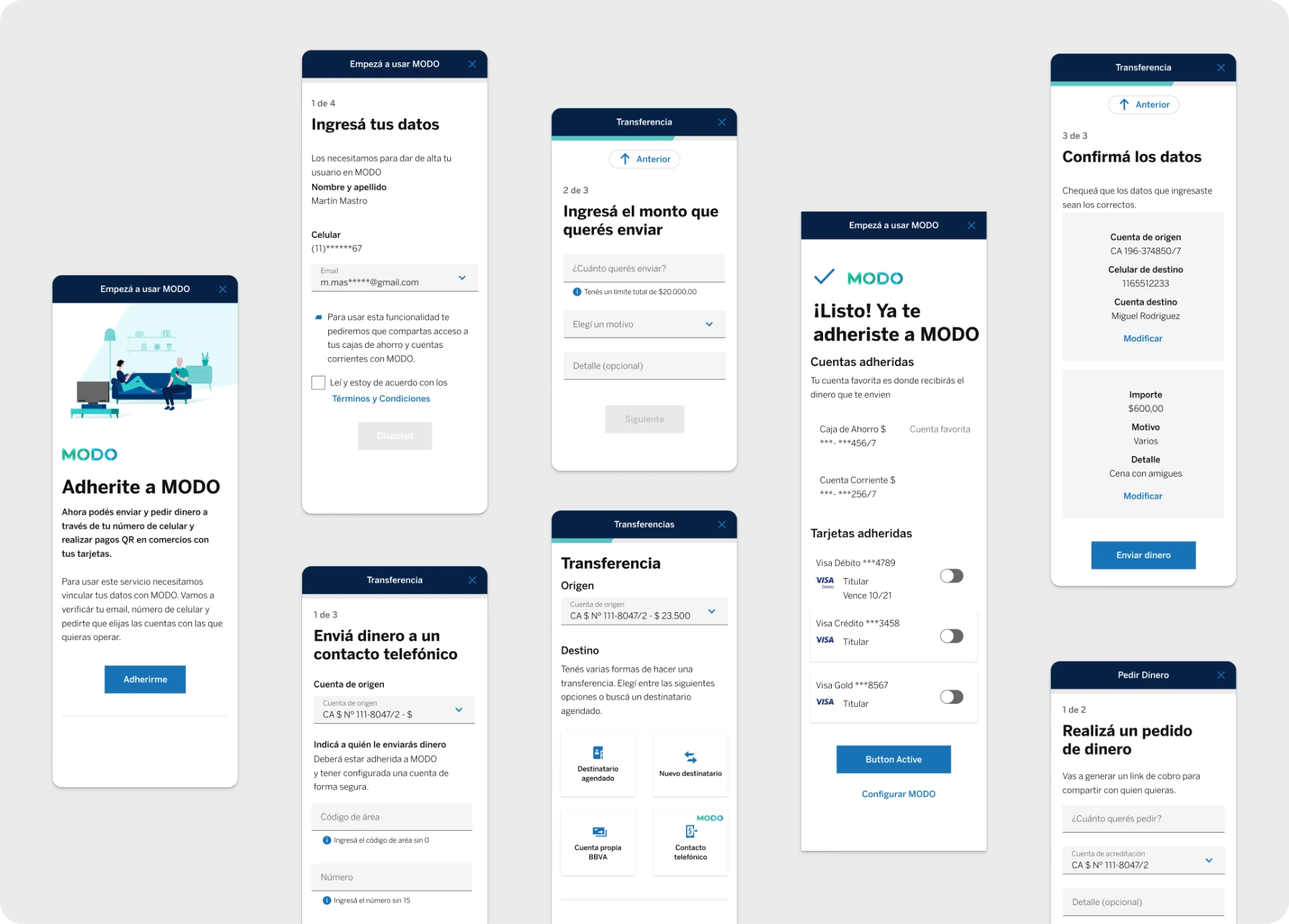
QR PAYMENTS AND SENDING MONEY
UX Research
The Challenge
Design an intuitive onboarding and transfer experience for a completely new financial service while helping users understand how it works, where their money goes, and why account enrollment is required.
The biggest challenge was balancing innovation with trust. Users were familiar with traditional bank transfers but had never interacted with a phone-number-based transfer system.


Research Approach
We conducted moderated usability tests across BBVA Online Banking and Mobile Banking with participants ranging from highly digital-savvy users to customers with limited technology experience.
What we wanted to learn
Success Metrics
| Task Completion | Can users finish the flow? |
| Efficiency | Time to completion |
| Satisfaction | SUS Score |
| Understanding | Qualitative feedback |
Task
This was the instruction for the users
"Last night was your friend Nicolás's birthday and, with everyone stuck at home during quarantine, you and the rest of your friends decided to surprise him by sending over a snack platter and some beers for dinner. You weren't the one who placed the order, so you ended up owing your share. How can we solve this?"
Hypotheses
H1
Users will find the feature more easily through direct-access shortcuts.
H2
Users will understand that enrollment in MODO is required before sending money.
H3
Users will understand which account receives money and which account sends money.
User Profiles
We worked with a varied set of profiles, which gave us insight across different age ranges and types of users — some with a strong relationship with technology and others with very little.

Profile · Tech-savvy
Martina G., 29
Marketing analyst, Buenos Aires
Frequently uses both Online and Mobile Banking. Prefers mobile for simple actions like transfers because of its speed.
"If it takes more than 30 seconds, I close the app."

Profile · Low-tech
Roberto S., 58
Independent shop owner, Córdoba
Has little relationship with technology, but trusts the bank to guide them through their operations.
"If BBVA says it's safe, I'll do it — but I want to be sure."
Round 1: What We Learned
What worked
- ✅Users consistently discovered the feature.
- ✅Direct-access shortcuts were preferred.
- ✅Users trusted BBVA enough to proceed through the flow.
What didn't work
Users didn't understand MODO
Many participants didn't know what MODO was, why they had to enroll, or how money would reach recipients.
Trust masked usability issues
Users often continued simply because the service belonged to BBVA, even when they didn't fully understand the process.
FINDINGS
- 1: Users found new feature.
- 2: Users trust a lot in BBVA and the services they provide.
UI PROBLEMS
- Problem 1: Users misread the data.
- Problem 2: Users did not understand that the favorite account they chose was the one that would receive money.
- Problem 3: Users didn't grasp that MODO is its own service, raising doubts about security and which account funds arrive in.
Key Insights
Insight 01
Users need more context before starting enrollment.
Insight 02
Users need to understand how MODO works before providing information.
Insight 03
The account-linking flow requires clearer communication.
Design Iteration
Based on the first round of testing, we redesigned several parts of the experience across four key stages.
Improved onboarding
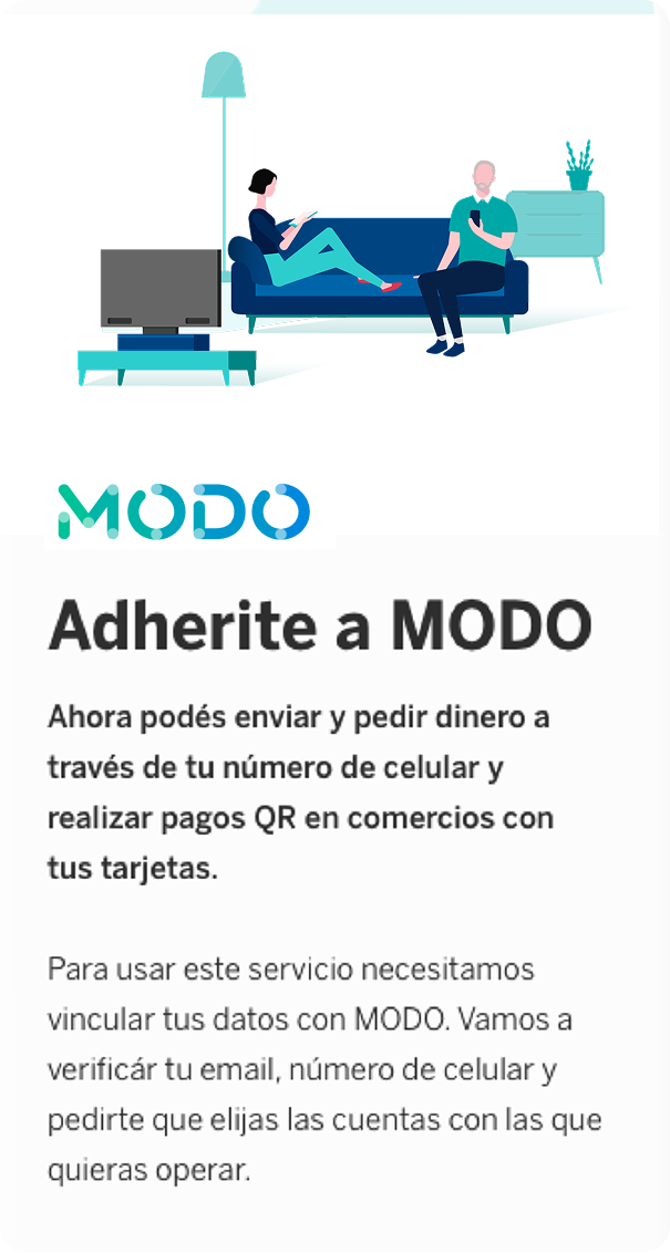
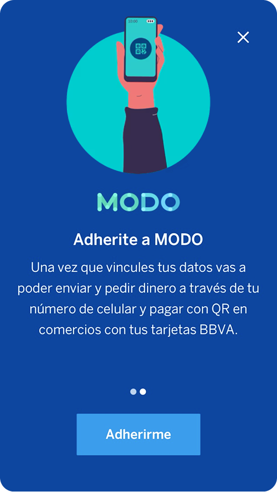
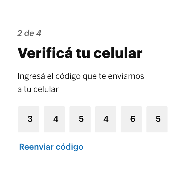
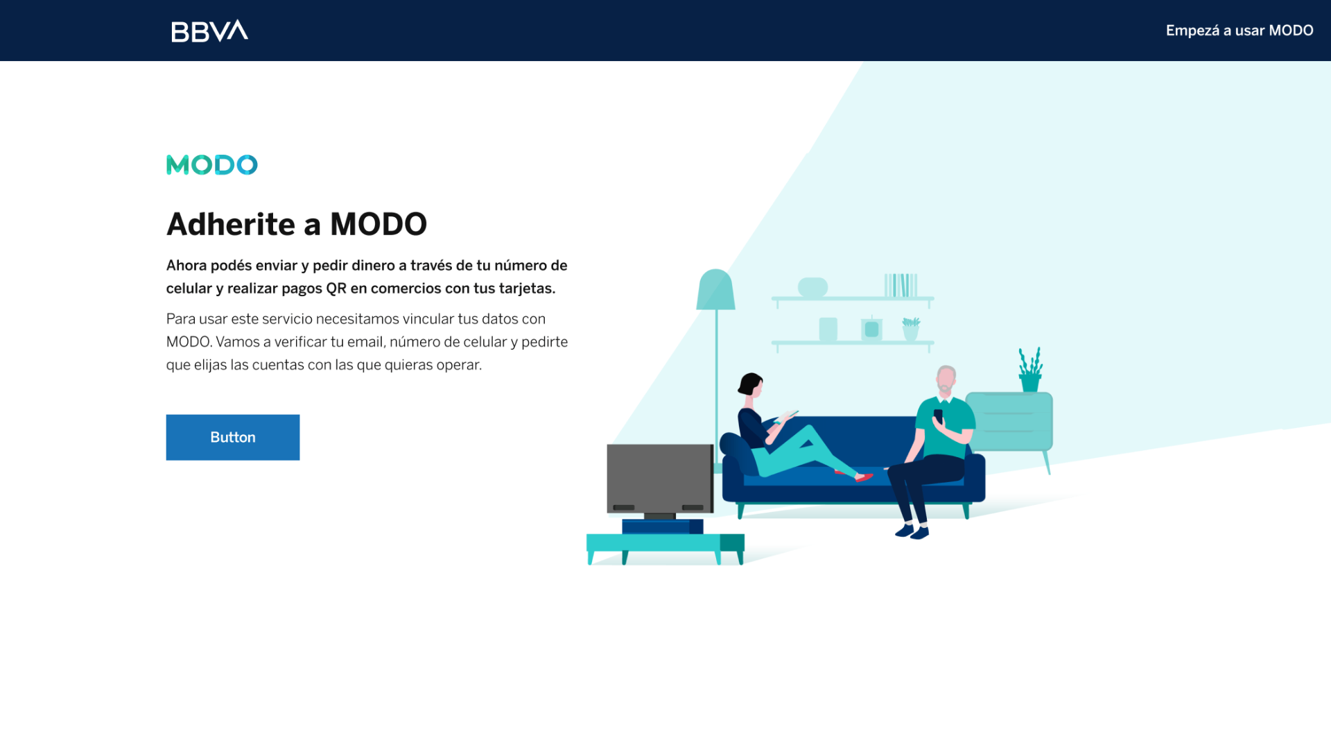
A dedicated experience explaining what MODO is, how transfers work, and why enrollment is required.
Reworked enrollment
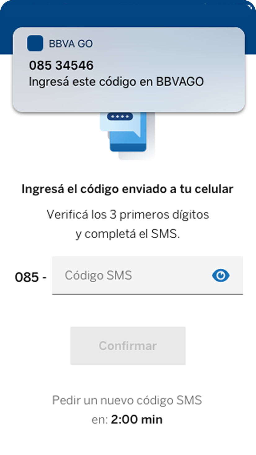
The enrollment modal was replaced with a full-screen flow for visibility and importance.
Refined microcopy
Updated labels and instructional content to reduce ambiguity throughout the flow.
Full journey testing
Expanded testing from enrollment alone to the complete transfer process.
Improved onboarding
A dedicated experience explaining what MODO is, how transfers work, and why enrollment is required.
Reworked enrollment
The enrollment modal was replaced with a full-screen flow for visibility and importance.
Refined microcopy
Updated labels and instructional content to reduce ambiguity throughout the flow.
Full journey testing
Expanded testing from enrollment alone to the complete transfer process.
Round 2: Validation
The redesigned experience was tested again with users.
Improvements observed
- ✅Better understanding of MODO
- ✅Better understanding of enrollment
- ✅Improved task completion
- ✅Faster navigation through the flow
Results
83.5
SUS Score
Well above the usability benchmark of 68.
2
Testing rounds
Iterative validation cycles.
5+
Users tested
Across digital-savvy and limited-tech profiles.
100%
Critical issues resolved
Onboarding, enrollment, account linking.
User Confidence
Participants reported feeling secure because the experience was backed by BBVA.
Reflection
The project reinforced the importance of testing complete user journeys rather than isolated flows. While users were initially able to complete tasks, usability testing revealed significant gaps in understanding.
By iterating on onboarding, content, and information architecture, we transformed a technically functional experience into one users could confidently understand and trust.

@2026 All rights, lefts and wrongs reserved