Let's Talk
United Healthcare
Healthcare Made Simple

Overview
Redesigned the plan-shopping experience within UnitedHealthcare's Medicare site — the search results and comparison flow millions of people use, often for the first time, to choose coverage they didn't ask to need.
Business case
- ✦Dense cards slowed side-by-side comparison.
- ✦Key numbers buried under long benefit tables.
- ✦Older, less tech-fluent audience needed clarity.
Goals
- ✦Simplify comparison, keep required info.
- ✦Let users compare multiple plans at a glance.
- ✦One flexible card for four plan types.
Challenges
- ✦Four plan types, different pricing, one card.
- ✦Wide range of digital literacy and ability.
- ✦Less density, same required disclosures.
Results
- ✦Smaller card, mobile-friendly by default.
- ✦Cost and enrollment moved to the top.
- ✦On-demand doctor and drug lookup.
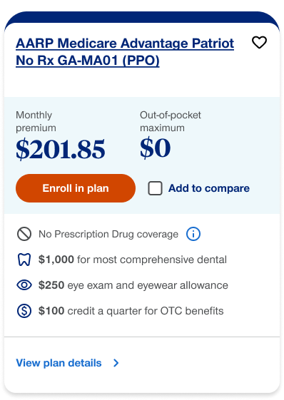
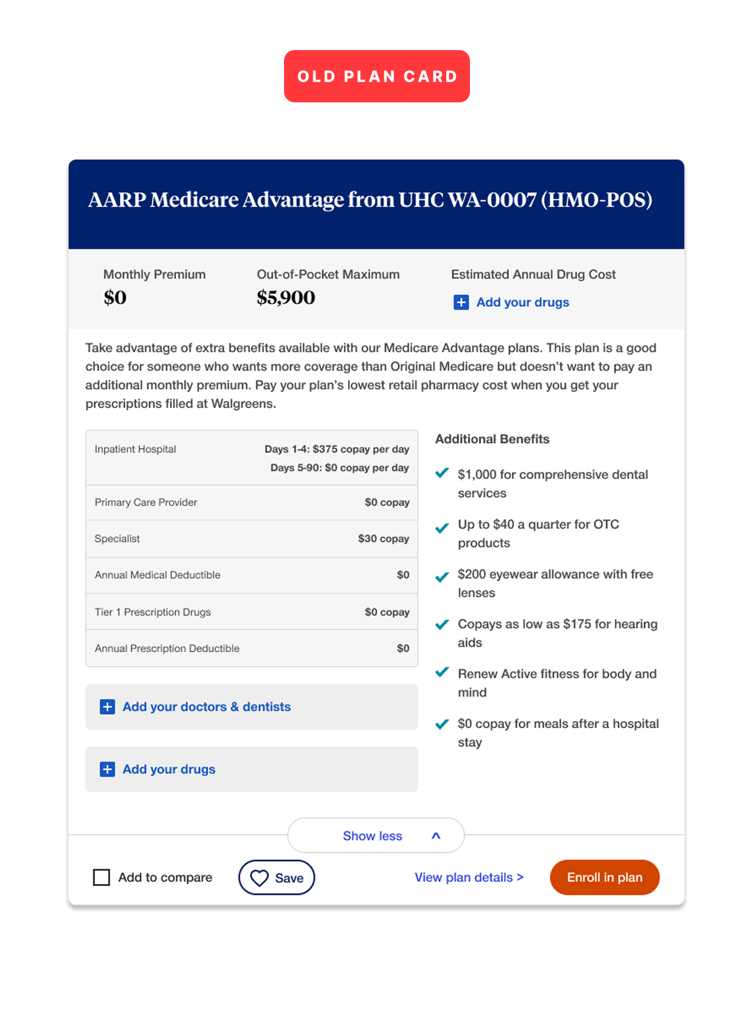
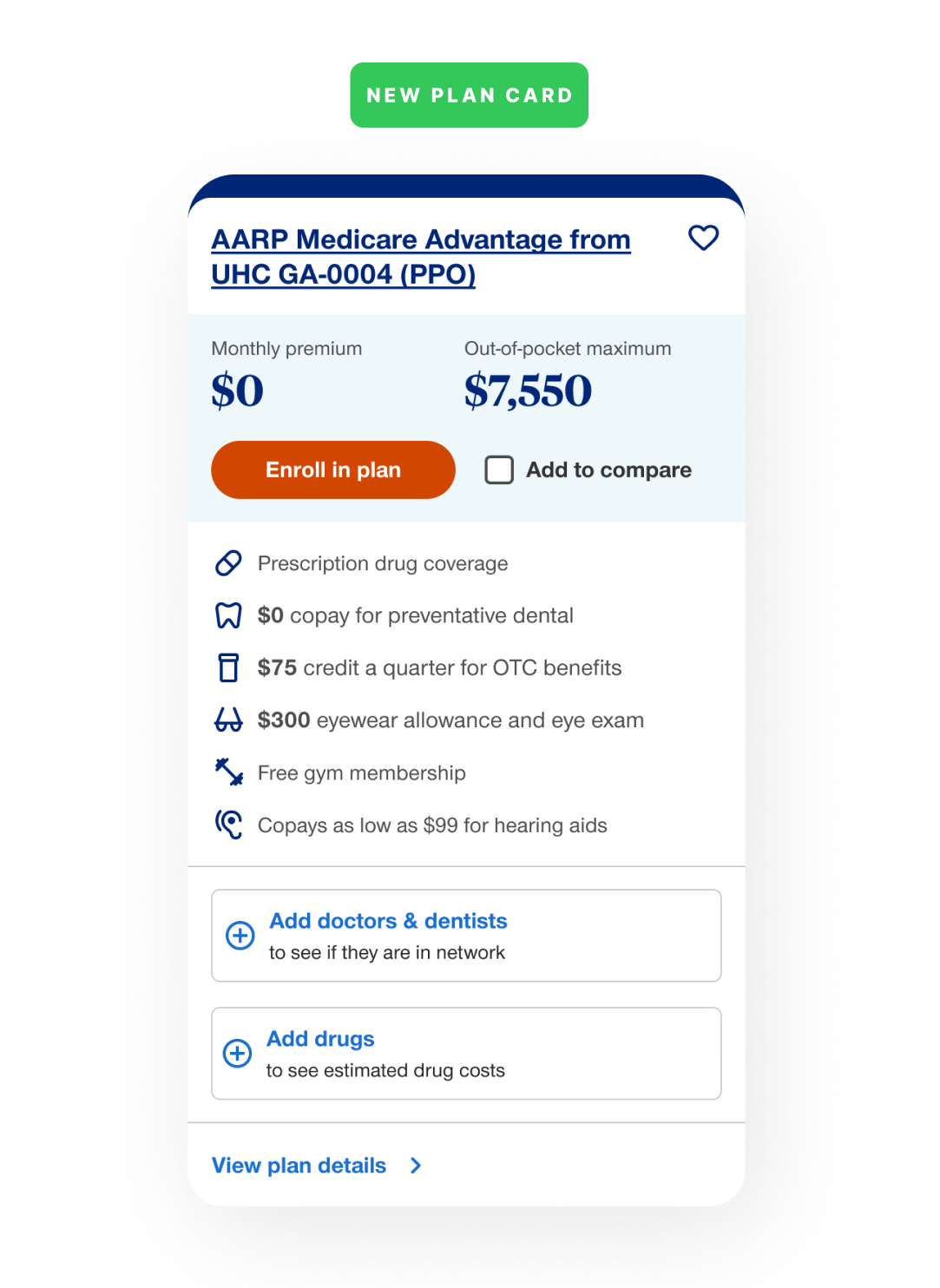
Old card vs. new card
Key decision factors surfaced up front
Before redesigning the card, I mapped the recurring friction in the old layout.
Context and problems
- No clear reading order — price, network, and benefits all competed for attention at once.
- Cost buried — monthly premium and out-of-pocket maximum sat under a wall of copy instead of leading the card.
- Flat benefits table — no visual hierarchy between a $0 copay and a $375-a-day one.
- Scattered actions — compare, save, and enroll competed for the same line as “show more”.
- Not comparison-friendly — the card’s length made it hard to hold two or three plans in view at once.
Design iteration
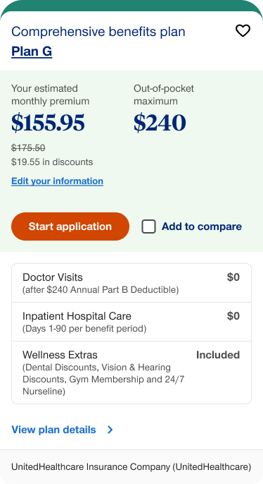
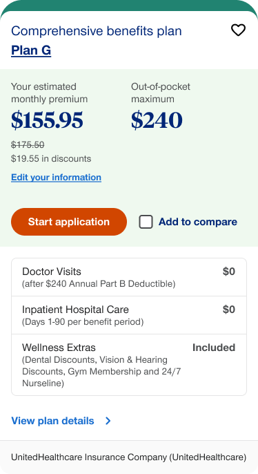
- Reduced size — Simplified the information, enabling users to view multiple plans at once and ensuring a mobile-friendly design.
- Cost and enrollment — Prices, enrollment, favoriting, and comparison features are now prioritized, with a more intuitive UI and improved accessibility.
- Benefits — Each plan’s unique benefits are now highlighted, with improved visuals and text for clarity.
- Customization — Optional actions let users quickly check if their doctors or medications are covered by each plan.
Variants and flexibility
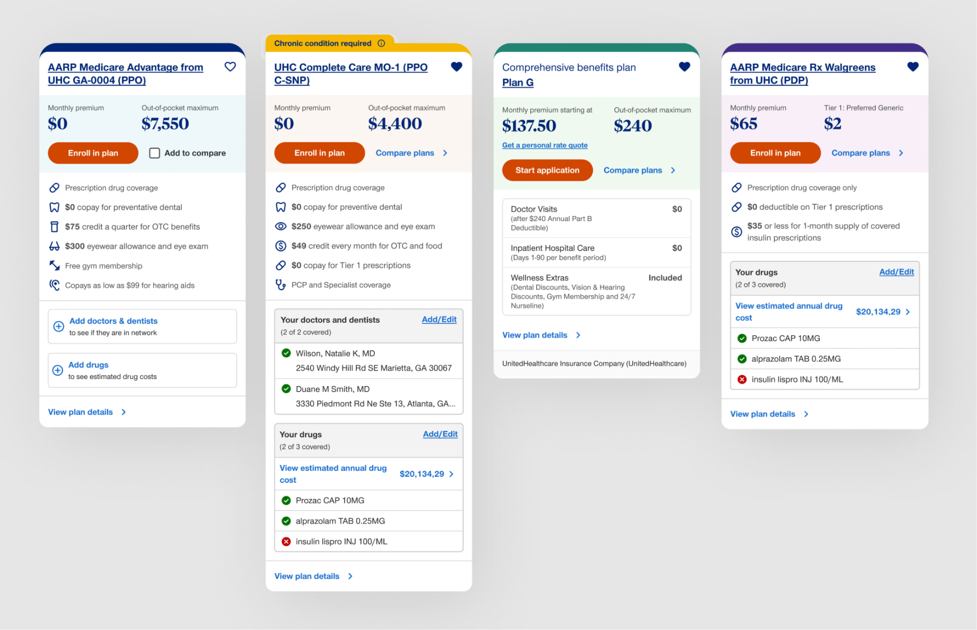
Componetization and color coding
A key challenge was designing cards that adapt to various factors like plan type, content, benefits, and customization. I introduced a flexible component with color coding to meet all requirements.
What the system handles
- Four plan families (Advantage, Special Needs, Supplement, Prescription Drugs) sharing one structure — header, cost block, benefits, actions.
- Conditional states — like a visible “chronic condition required” flag instead of a footnote.
- Field swaps per plan type — a Part D card shows drug-tier pricing instead of an out-of-pocket maximum.
Plan-family color coding
Advantage
#002677
#EEF8FB
Supplement
#218371
#EFF9EF
Special Needs
#F5B700
#FCF6F1
Prescription Drugs
#422C88
#F8EFF7
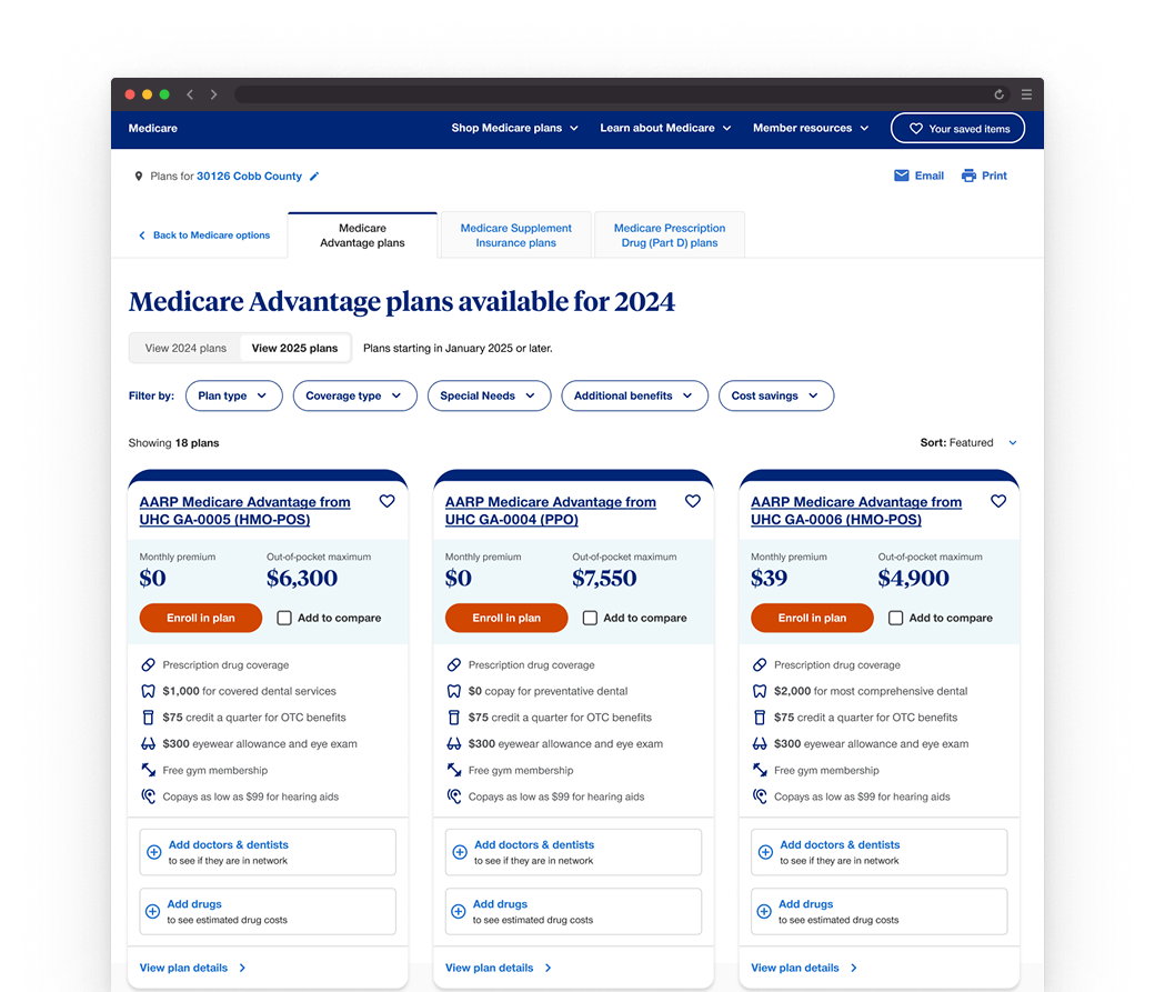
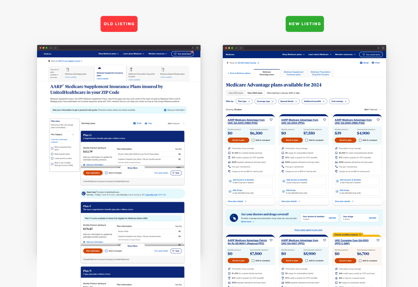
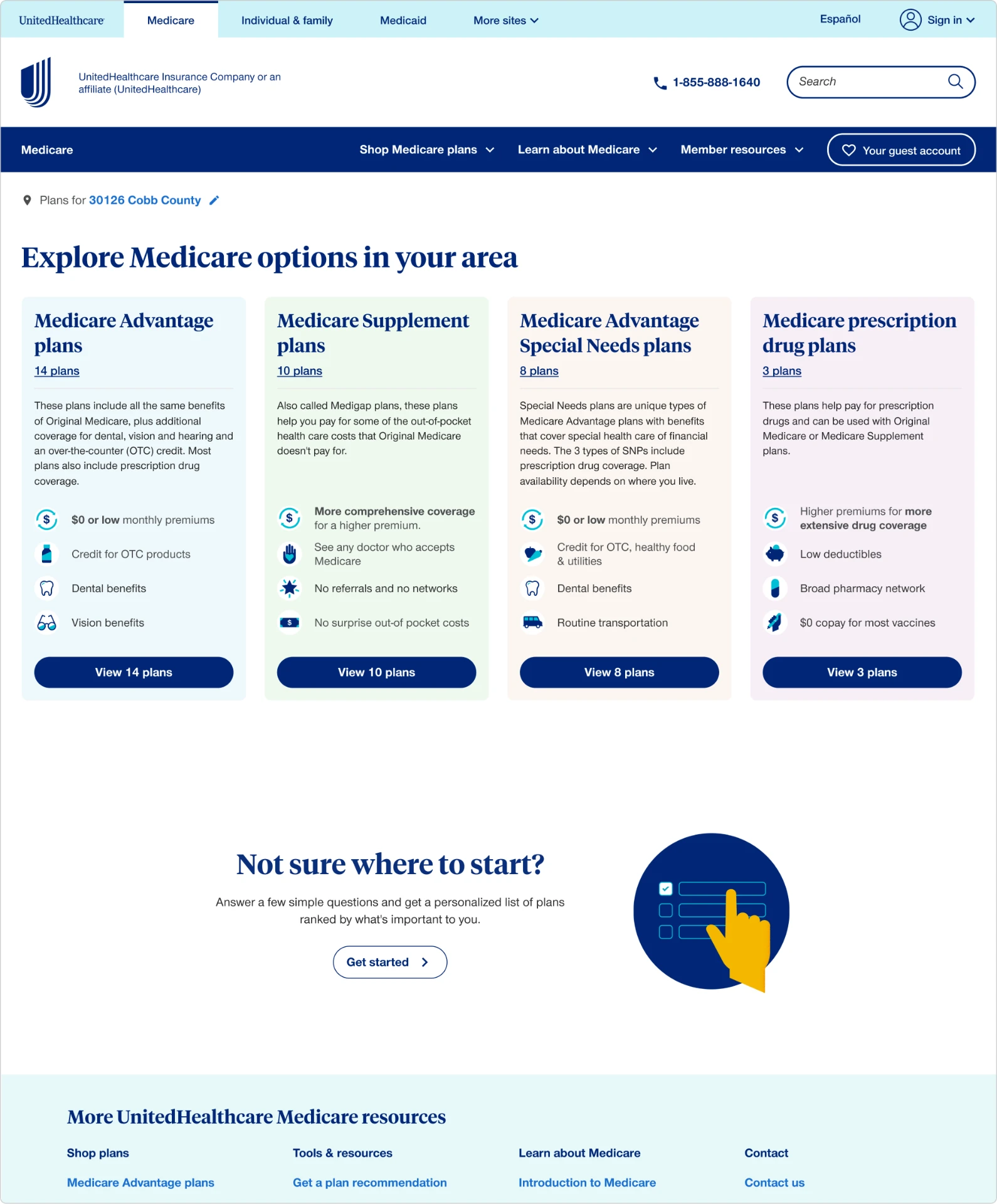
Old listing vs. new listing
The page around the card matters too
What didn’t work
- Filters buried — in a side rail, easy to miss.
- Plan types split — into unlabeled icon tabs.
- Expand-to-compare fatigue — each card’s “show more” pushed the next plan further down, so comparing three plans meant three scroll-and-expand cycles.
What changed
- One control bar — plan-type tabs, ZIP code, and filters combined into a single horizontal bar at the top.
- Scannable grid — plans shown in a grid instead of a single stacked column.
- Shared coverage prompt — “Are your doctors and drugs covered?” surfaced once, instead of repeated inside every card.
Reflection
Faster to understand and trust
Less time, clearer decisions. Surfacing cost, doctors, and drug coverage — the factors that actually drive the choice — cut how long it takes to compare plans and made each comparison easier to trust.

@2026 All rights, lefts and wrongs reserved